Do you know The Design of Everyday Things by Don Norman?
It’s a great book.
Don believes that everyday objects should be easy and intuitive to use.
Many are not and Don has examples. He uses them to show that a good design is no coincidence but a matter of process.
What caught my attention is how similar this is to the process of writing or, more generally, of making ourselves understood.
Take the example of the stove.
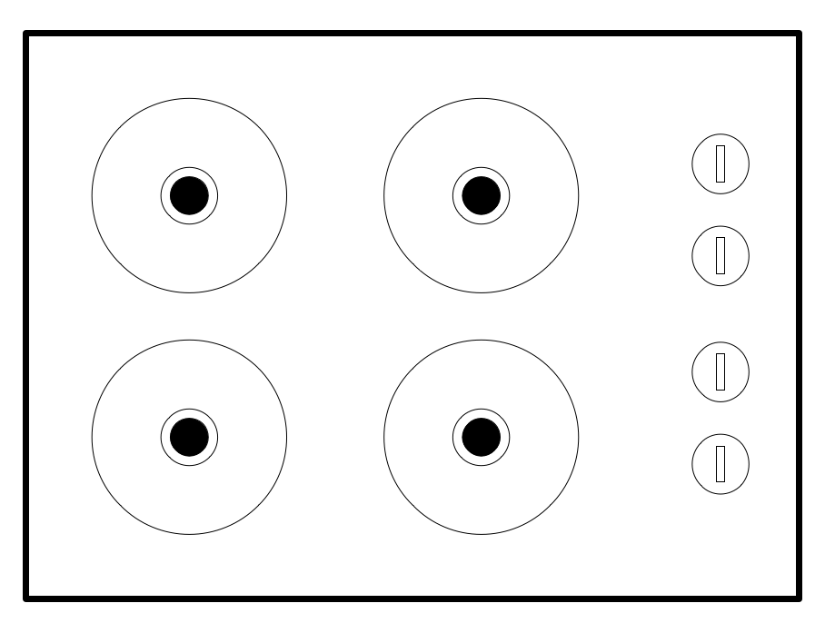
Our kitchen has the stove-design that Don mentions in his book. I bet you know it:
I always put the wrong burner on and it drives me crazy.
It also makes me feel stupid. But Don raises an interesting question: Should I feel stupid because I keep repeating the same mistake?
His answer is on these lines:
“No! This is not your fault. The design is at fault. The positioning of the controls is arbitrary. It doesn’t tell you which control belongs to which burner. There is no visual clue.”
True, there are small labels (not pictured in my little sketch above).
But these labels don’t help. Why not?
On autopilot
Because, and this is the important part, many of our everyday activities are automatic. We do them on autopilot; without thinking. And we want the autopilot. We want things to be as automatic as possible.
The job of the design is to make them as automatic as possible.
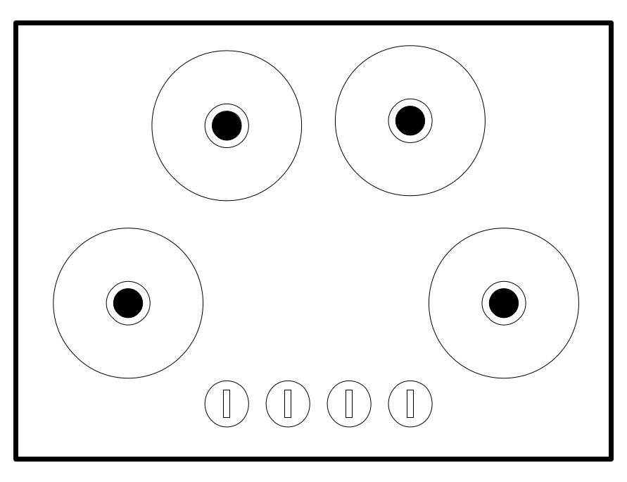
Like this:
There is no ambiguity here. We intuitively understand which control to use.
This solution is not the result of a sudden idea. It’s the result of a test where the designers observe how people use the object: Is it intuitive? Or does something make the user stumble?
It’s a second step and every design needs that second step. In other words: the design process must have two phases.
The first is to come up with an idea, a prototype. The next phase is to test it and adapt it.
So what does this have to do with texts?
Like our use of everyday things, reading happens in automatic mode.
It’s one of the activities where we want to be on autopilot.
We want the process to be fluid.
We don’t want to get stuck in mid-sentence. We don’t want to stop and ask ourselves: ‘Hang on, am I understanding this correctly?’
Another book I recently read, constantly had me asking such questions. The book (in German) is about how humans perceive time. It’s highly interesting. But the author often jumps to conclusions that I can’t follow.
Shall I blame myself that I can’t keep up with his thoughts?
“No!”, I can hear Don Norman say: “This is not your fault. It’s up to the author to make you understand.”
Like a design, the making of a text must have two phases.
The first phase is to digest and understand the topic for yourself. It’s when you become clear about what you want to say.
Then comes the second step: to check whether other people can follow you.
The slippery slide
The famous copywriter Joe Sugarman has a great metaphor for this: your text must be a slippery slide.
Nothing must stop the ride. Your words must carry the reader down. One sentence must lead to the next, one thought to the other.
This includes the check: can others follow my train of thought? Or do I take steps that are obvious to me but that the reader cannot see?
There is no ease of reading if the author doesn’t ask these questions.
Take most philosophy texts.
The authors don’t seem aware (or don’t care?) just how difficult their sea of vocabulary is for those who don’t swim in it all day. What they are missing is the second phase: to translate their ideas into a language that we understand.
So, if you want to be understood, move into the second phase. Make your readers slip down that slippery slide.
P.S.
A small note on Don Norman’s book: I thoroughly enjoyed reading it but many examples are now outdated. An updated edition would be great to have.


3 thoughts on “If you want to convince: What you can learn from the design of everyday things”
Good Morning,
So glad that you liked Dr. Norman’s book. For this record, Dr. Norman’s name is Don not Dan.
Have a nice day!
Hi Susan,
what mistake to make. I corrected it in the post above.
As said above, I hope Don is working on a new edition! I’d love to see some recent examples.
Hi Carsten,
Funnily enough I have been reflecting on “am I getting the message across” recently but more at a subconscious level. I came to realize that what is obvious to me is not necessarily obvious to my audience, busy people with many other preoccupations! I think it is important to begin by putting the issue into context, keeping it short, easy to understand/avoid unnecessary (technical) details and if feedback is required ensure that what is required is clearly stated. Your blog has pulled this thought from my subconscious to conscious mind which results in me finding myself asking the question before delivering the message – not afterwards when its potentially too late so thanks!!