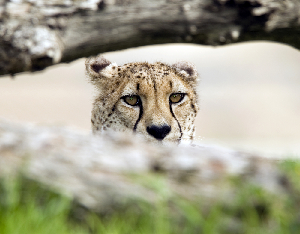
Usability experts compare website visitors to carnivores.
Imagine a cheetah in the Serengeti.
When she picks up a scent, she will follow it. But the scent has to get more promising. If it doesn’t, she will not continue the hunt.
The visitors of your website are the same.
They hunt for information and your links and headings are the scent that leads them to their prey. If it doesn’t, or if it takes too many steps to get there, they will stop hunting and leave your site.
Seeing our visitors as carnivores, or informavores, reminds us that they are no tolerant creatures. Usability studies show this again and again: people don’t come to our websites to spend time and have fun. They are looking for information and they leave our sites as soon as our links (and headlines) don’t deliver on their expectations.
So what to do?
Double-check every link, every teaser and every headline:
- What does it promise?
- Which expectations does it raise?
Then, test it with users. Are their expectations what you think they are? It’s tempting to skip this step but it’s good to take it because you always get surprises.

