Are you suffering from e-mail overload?
Most of us do.
Let’s help each other and make e-mails (those we do need to send) easy to read.
Here is a user-friendly format.
It is based on the fact that reading on a screen puts more strain on the eye than reading on paper.
Jakob Nielsen’s landmark eye-tracking studies from 2006 show how this influences our reading behaviour. At least at first, we don’t read word by word, we scan the screen in an F-shaped pattern:
Nielsen’s studies were made for websites, not for e-mails, but there’s an important lesson: you have to avoid dense text.
Give the eye something to grab
That’s especially important in the first sentences. Your eye must be able ‘grab’ the words as you scan.
Compare these two examples of web text:
The text on the left, by Guy Kawasaki, is very interesting but the dense format is not inviting. The lighter text is easy to ‘grab’ and that means people will read it more relaxed and with a better feeling.
I use the same technique for my e-mails
- I start with one line — the shorter, the better.
- I keep paragraphs to two lines, maximum three.
- I follow a longer paragraph with a single line.
- I try to keep sentences short.
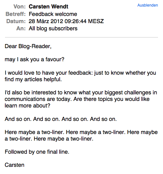
An ideal result looks like this:
It doesn’t look spectacular but compare it to emails in your inbox that start with a big block of text: it makes a difference.
A different design
The bottom line is that an e-mail, like a web text, needs a different design than a printed text. It needs more white space.
For example, I often start a new paragraph where I wouldn’t on paper. Even though sentences belong together from a content point of view, I split them up in an e-mail. For the sake of readability.
Guy’s five sentence rule
I also try to follow Guy Kawasaki’s recommendation: limit the text to five sentences.
That’s not always possible but it’s a great guideline because it forces you to treat your e-mails with greater care.
It is in the nature of any writing process that, as we write, we become more clear about what we want to say. It means that we can identify the words that we don’t really need. It’s simple, really. We just have to take the time and go through our emails a second time to cut all the words and sentence we don’t need.
So far my contribution to making our e-mail-lives easier.
What are the tricks you use in your fight against e-mail overload?
Thanks to Svilen Milev from Effective for making the feature image available.


2 thoughts on “Lighten up your e-mails”
Hi Carsten
The header of an email is for me important. Specially when you start to search an old email and your emailprogram can search only headers.
Some headers are not written to invite the reader to read it. I do get some emails asking for support and when the header just says “error” and the body just contains an screenshot i just don’t want to help.
greets Jan
Hi Jan, I almost forgot how tedious it can be to find e-mails before I switched to the Mac with its wonderful search function.
The point you raise is interesting: that you are more motivated to help if people make it easy for you. It only goes to show that it’s not just good for the receiver but also for us to take a little more care in drafting our e-mail headers and texts.