Do you know how Amazon’s homepage looks like?
The truth is:
You can’t be sure.
You probably see a different page than I do. Amazon shows us different versions to test:
- does this button draw more clicks when it’s further to the left?
- does the teaser get more clicks than the shorter one?
- do we get more clicks if we change these two words?
Companies like Amazon test these things because they make a difference. A series of small tweaks can increase conversions by hundreds of percent, we saw that in the case of Dustin Curtis.
It ain’t no fun
So, if testing is so important why don’t we do it ourselves?
The answer is, of course, that it’s cumbersome. That’s why I am going to propose an alternative:
if we don’t test, let’s learn from those who do.
Learn from those who test
There is nobody better to learn from than direct response copywriters. These are people who write an advertisement, not in order to build brand awareness, but in order to sell on the spot.
They have one measurement only: after reading my advertisement, will you order?
And they have a sure way to know:
They publish version A of a print-ad on Monday and version B (maybe with a different headline) on another day (or in a different city). Now they only need to count which version draws more sales.
Building on what works
Direct response copywriters have a long tradition of testing.
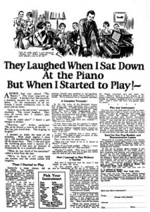
Take a look at this ad by John Caples.
It’s from 1926 and one of the most famous ads in history.
It’s famous because it sold a lot (of music courses). But Caples didn’t invent the layout. He built on what he and his colleagues knew worked best, namely:
- a big picture above the headline
- then the headline
- followed by the body copy in three narrow columns (short lines!)
Effective or creative?
David Ogilvy, another great man of advertising, used a similar format for his ads. He began his career in direct marketing and he was no fan of ‘creative’ people who try to reinvent the wheel.

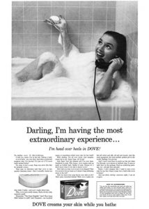
Most of his ads resembled that of Caples. Look at his Dove-ad on the left.
Yes, the picture is bigger and the ad looks more modern. But key elements remain the same:
a picture above the headline, followed by the headline, followed by three narrow columns.
Like ‘real’ content
Caples’s and Ogilvy’s ads resemble the ‘real’, editorial content of magazines. And that is no-concidence:
Magazines live from the sales they generate. They can’t afford to reinvent the wheel. They build on what works. They copy from each other.
And so should we.
Let’s copy
Here’s something really easy you can do.
Compare your favorite magazines.
Which layouts and content-types do they use? Do you see recurring patterns? You surely will and you can do worse than copy some of those.


One thought on “Do you test your texts?”